Autumn Wedding Season: Colour Palettes and Paper Choices for September-November Weddings
Table of Contents
Autumn brings crisp air, golden leaves, and warm light across London.
Planning a wedding for the autumn wedding season means choosing rich
tones that match the time of year. Paper choices matter just as much as your
flowers.
Heavy textures, deep berry shades, and soft cream cardstock set the mood
before guests even step into your venue. We help couples across the capital
bring these tactile print details to life at ExactPrint.
London's autumn wedding scene spans everything from grand hotel ballrooms
to converted warehouses and countryside barns just outside the city, and the
paper choices that suit each setting differ considerably. A heavy, textured
stock that feels perfectly at home on a rustic wooden table can look out of
place against the crisp white linen of a formal ballroom reception, so it is
worth choosing your palette and stock together with your actual venue in mind
rather than picking a colour scheme in isolation.
Booking your stationery early in the season also matters more than
couples often expect. Autumn weekends are some of the busiest on the wedding
calendar in London, since the season offers cooler weather for photography
without the winter risk of a rained-off outdoor ceremony. That popularity means
printers, florists, and venues all see a surge in demand across September,
October, and November, so confirming your paper choices a few months ahead
avoids a rushed reprint if a design needs adjusting closer to the date.
Warm Autumn Palettes That Look Great in Print
Deep shades work best when paired with neutral backgrounds. Bright
sunlight fades in September, so rich inks add warmth to your paper items.
Early autumn light in September still carries some of summer's
brightness, while a November wedding sits under noticeably softer, greyer
daylight, so a palette that photographs beautifully at the start of the season
may need slightly richer, deeper tones to hold the same warmth later in autumn.
- Deep Burgundy
and Rust: These tones create a cosy feel. They look striking on warm ivory
card stock.
- Forest Green
and Ochre: Natural shades mirror falling leaves. They bring a grounded look
to your table setups.
- Plum and Warm
Gold: A regal pairing. Soft gold text on dark purple paper creates
instant elegance.
Heavy ink coverage requires good stock. Thin paper gets soggy under dark
ink, which ruins the finish. Printed order of service sheets and invitations
need weight to feel special in the hand.
A simple way to test whether a colour and stock combination works is to
request a small sample run before committing to your full invitation quantity.
Seeing how gold foil or deep ink sits on your chosen cardstock under normal
room lighting, rather than judging it from a screen, catches problems that are
easy to miss in a digital proof.
Metallic inks in particular behave very differently depending on the
angle and warmth of the light in a room, which is why a swatch checked only
under a bright office ceiling light can look noticeably different once placed
on a guest's table under warm evening candlelight. Bringing a small sample to
your actual venue, if a site visit is scheduled before the big day, is worth
the extra step for couples set on a specific gold or copper foil finish.
Selecting the Right Paper Stock for Autumn
Paper texture changes how a colour feels. Smooth white paper can feel too
stark for an autumn theme.
- Uncoated
Cardstock: This paper absorbs ink gently. It gives deep shades a muted, soft
feel.
- Textured Kraft
Paper: Earthy and simple. It fits rustic barn weddings and dried flower
displays.
- Silk Finish
Card: Adds a subtle sheen without harsh glare. Good for reading under
warm indoor lights.
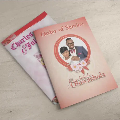
We print your A5 Order of Service booklets on sturdy
uncoated stock so pages turn smoothly during the ceremony.
Couples planning an outdoor or marquee ceremony should also think about
how paper handles a slightly damp autumn morning. A light spray of protective
coating on booklets and programmes left out before guests arrive can prevent
pages curling if the air is humid, without changing how the ink or texture
looks to guests holding the finished piece.
Kraft paper in particular photographs beautifully in natural autumn
light, which makes it a popular choice for couples planning documentary-style
photography during the ceremony itself, though its slightly rougher texture is
worth testing against your chosen ink colour beforehand since darker shades can
appear more muted on an uncoated brown base than they would on bright white
stock.
On-the-Day Print Details for Your Reception
Receptions in late autumn move indoors quickly as the sun sets. Your
table stationery should guide guests smoothly while matching your autumn decor.
- Keep text size
readable in dim evening light.
- Match table
numbers directly to your main theme colours.
- Group items
together for a clean look on each table setting.
Place custom Menus on every plate to introduce seasonal
dishes. Add matching Tent Cards so everyone finds their seat without
any trouble. A big Seating Plan board placed near the door keeps crowds
moving easily.
Ordering a handful of spare place cards and a few blank table numbers
alongside your main batch is a small precaution that saves a lot of stress if a
guest list changes in the final week, which happens more often than most
couples expect during the run-up to an autumn wedding.
Coordinating your menu and tent card sizing with your caterer ahead of
time also avoids a last-minute scramble, since a card that is too tall can
block sightlines across a table and one that is too small gets lost among
glassware and centrepieces once the table is fully set for the evening.
Print Finishing Tips for Late Autumn Events
Small choices make a big impact. Matte finishes handle ambient warm light
better than glossy ones. Heavy card stocks stop cards from bending if the air
gets damp near venue entrances. We suggest keeping overall designs clean. Rich
colours speak for themselves without clutter.
Even small hardware choices, such as the ribbon used to tie a menu to a
napkin or the wax seal on an invitation envelope, benefit from the same
restraint. A single well-chosen finishing touch reads as intentional, while
several competing decorative elements on one piece of stationery can make an
otherwise elegant design feel cluttered by the time it reaches a guest's hands.
Consistency across every printed piece, from the invitation through to
the final thank-you card sent after the big day, is what makes an autumn
wedding suite feel considered rather than assembled from several different
sources. Choosing one or two core colours and a single paper finish, then
applying them across every item on your stationery list, gives guests a
coherent sense of your theme from the moment the invitation arrives in the
post.
This same consistency extends naturally to smaller details many couples
overlook until the final weeks, such as favour tags, welcome signs, and order
of service covers, all of which read as part of the same considered design when
they share a single colour palette and finish rather than being sourced
piecemeal from several different suppliers.
Plan Your Autumn Wedding Print with ExactPrint
September and November dates arrive faster than expected. Getting your
print items sorted early keeps your planning stress low. We print everything
locally in London with care and speed. Visit ExactPrint today to get your
wedding print started.
A realistic timeline helps most couples stay calm through the process:
confirm your colour palette and paper stock around four to six months out,
finalise invitation wording and send save-the-dates once your venue and guest
list are locked in, and leave reception stationery such as menus, table
numbers, and seating charts until your final numbers are confirmed a few weeks
before the day itself.
Frequently Asked Questions
What paper weight works best for autumn wedding invitations?
We recommend 350gsm cardstock. It feels thick, holds deep ink shades
well, and will not bend easily in transport.
Can we print custom seating charts on thick board?
Yes. We print seating charts directly onto sturdy foam boards that stand
easily on easels without any sagging.
How fast can we get our autumn wedding stationery printed?
ExactPrint offers same-day printing across London for most order types
when you submit final artwork early in the day.
What finishes reduce glare under indoor venue lighting?
Uncoated or silk paper finishes absorb light gently, making your menus
and place cards easy to read indoors.
Can we request sample paper stocks before placing a full order?
Yes. You can visit our London shop or contact us to check paper textures
and weights before ordering.