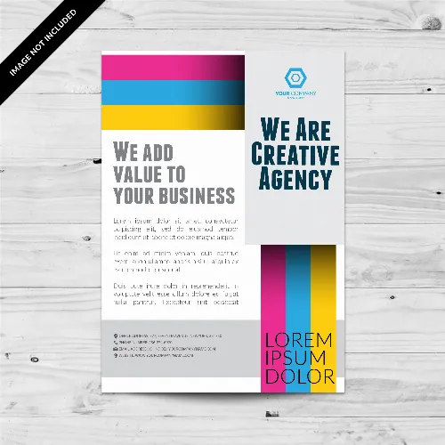
How to make a flyer in just seven easy steps?

How can I make a flyer in just seven easy steps?
Typically, a flyer is a folded, printed sheet used to promote a service, product, event, or concept. Typically, it conveys a straightforward message in a short amount of time. It is one of the marketing tools that gets used the most.
In this article, you will learn how to make a flyer that is both effective and eye-catching in just six easy steps. You can also get ideas from the examples of flyer templates on exactprint flyer examples. Flyers are used for things like marketing campaigns, invitations to events, and information about your company's products or services.
You can use these flyer examples to make your company or organization stand out from the crowd.
Some are single-sided flyers and others are twofold sided:
The most effective method to make a flyer in 7 stages
Now that you've seen two or three flyer models, we will tell you the best way to make a flyer that is attractive and educational while likewise meeting your objectives.
Flyers' ability to be eye-catching and informative while also containing a call to action is their biggest selling point. This could be an invitation to contact your company via phone or email to schedule a consultation or to visit your store to purchase your goods or services.
Here's a quick guide to getting started if this is your first time making a flyer from scratch.
1. Select a color scheme that is related to your brand.
2. Think about your goal three.
3. Consider where you will put the information
4. Produce persuasive writing.
5. Incorporate eye-getting pictures
6. Include all significant information
7. Include a CTA
1. Choose a color scheme that is related to your brand The general rule is to use the colors of your brand that your company has used in the past and then add other colors that are similar to them.
The 60-30-10 color rule is one method we recommend using, despite the fact that color selection is one of the most fundamental principles of visual design. However, if you are not familiar with color, it can take some time to figure it out. It involves selecting a primary color shade: red, blue, or yellow, and then picking two colors that go well together.
The design should be made up of 60% of your primary color, while the other two colors can make up 30% and 10%. You can always add one or two more colors, but the purpose of this color rule is to ensure that your design follows a hierarchy.
Choose colors that match your primary color using a tool like Adobe Color. Keep in mind that your flyer's color scheme is likely the first thing your audience will notice, so it's important to get it right.
Check out our guide for a more in-depth look at color schemes: Part 2: Choosing Your Color Scheme Tools for Combining Colors
2. Consider your objective Every successful flyer begins with the pre-design phase. Although it may appear insignificant, keep in mind that a flyer conveys a message that must originate from a previously planned concept and idea.
Therefore, in order to determine the purpose of your flyer at this stage, you should carry out the following actions. This is where you and your team need to talk about specific things, like who it is for and what you want to accomplish with it.
Identify your target audience Before starting to design your flyer, think about who you want to see it:
• Who are my ideal customers?
• What are their requirements, obstacles, and issues?
• What can my business, brand, or company do for him?
• What kind of content is most likely to pique your interest?
• What would pique that individual's interest in my flyer?
You will be able to make decisions about your flyer's design that are more logical as a result of your improved comprehension of the audience. Your flyer won't have the impact you expect it to have if you don't know who you're designing it for, or worse, it might look fake and irrelevant.
Identify your brand's personality It is essential that the design adheres to your brand's image and personality. Any flyer you create will automatically be a reflection of your organization and what it stands for if you are a business with a brand.
You must consider how you want others to perceive you. What principles do you uphold? Your designs will not be consistent with your brand if you are unable to answer these questions.
Define the message Keep in mind that your flyer's primary goal is to inspire readers to take action—either by contacting your company or purchasing your product or service—but they must first be interested in reading it.
You should use your flyer's specific message as a guide for all of your design choices. For instance, if you want people to come to your job fair, your design should make them feel happy and optimistic.
This could entail using upbeat language and vivid colors, as well as putting colorful pictures next to the goods and services your company offers.
Therefore, when designing your flyer, keep these objectives in mind:
1. It must serve as a means of communication between your business or organization and potential clients.
2. It must be used as a sample or reference for your products and services.
3. It needs to boost your credibility while also supporting your sales efforts.
4. It must bring in customers.
3. Consider where you will place the information on the flyer because there is only so much room for it. Because of this, it is critical that you only include information about your business that your reader and potential client need to know at the outset.
It's best to make an outline so that the information you present is clear, clean, and concise. To keep their attention, you will quickly demonstrate what distinguishes your business, product, or service.
4. Write texts that are persuasive Now is the time to write the texts that are based on your outline and include them in your flyer. You will need to keep the following things in mind so that your text and other graphic elements match:
text layout To instruct the reader where to look, such as in your headline and call to action, you must use the size and position of your text elements.
The visual hierarchy principle must be remembered here. Be sure to check out our guide on using fonts to create a visual hierarchy because this can be a tricky subject.
Typography If you already have a signature font for your business, this is a great place to start. You can use it throughout the flyer or add a font that complements it.
Keep in mind that the mood and message of your flyer will be significantly influenced by the fonts you choose. You can play around with decorative typefaces, which help readers focus on your headlines.
However, one thing to keep in mind when it comes to typefaces is to not combine more than two distinct typefaces or four types of variations (such as font size and bold/italic style).
Read our guide to typefaces for a more in-depth explanation: II Typography: Four Things to Know Before Pairing Fonts Correctly
5. Include eye-catching images If you've already identified the personality and image of your brand, selecting a suitable image for your flyer shouldn't be hard. Your design can have a great visual impact with the right image.
A picture can say a lot more than words can. Your flyer design relies heavily on relevant images. You must consider the following at this point:
• Choose a picture that helps keep the text and image in balance.
• Search for images that have a single focal point. You can then surround those images with text and other visual elements like graphics.
• Ensure that the images you select are directly related to your content or any accompanying text sections.
• Choose a picture that truly reflects your message and the objectives of the flyer.
• People find smiling faces extremely appealing. Go ahead and include a person's face in your flyer if you think it is important.
6. Include all crucial details When designing a flyer, it's easy to overlook obvious details.
The majority of designers start by making a list of things that should be included. Then, they make another list of things that could be included if there is room, if they think they are important, or if they fit the content.
Do you require information about the event, such as its date, time, and location? Or is it about reporting to generate interest in an event or purchasing tickets online? Ask yourself these questions so that you don't forget to include all of the necessary information in your flyer.
7. Include a Call to Action (CTA) If your prospect has taken the time to read your flyer and is unsure of what to do next, they will likely discard it and forget about what you're selling. As a result, it's critical to include a CTA (call to action) or call to action that readers can easily see.
It only makes sense to draw people's attention to the CTA, but not so much that it overshadows the headline, since the CTA's purpose is to motivate them to take action.
In the event that you believe your CTA and contact data should stand apart from the text around it, utilize a differentiating tone. Variety can be utilized to assist with demonstrating order in your plan. It would be even better if you could match the colors, making the content stand out even more.
Start creating your own flyer right away. This guide should provide you with everything you need to create and print an appealing flyer that is relevant to your ideal customer. This is only meant to provide a general overview of the flyer design process and is not intended to be an exhaustive guide.
Therefore, the steps to making a memorable flyer are as follows:
• Pick a color scheme that is consistent with your brand • Think about your goal • Plan where to put the information • Write persuasive texts • Use catchy images • Include all of the important details • Add a Call to Action
