How to Design a Flyer That Gets Read: Layout and Print Tips for UK Businesses
Table of Contents
Most flyers get a glance and a
bin, somewhere between two seconds and never. That is the blunt reality of flyer
design nobody tells you when you are excited about a new promotion. We have
printed flyers for market stalls near Brick Lane, salons on Peckham High Street
and startups working out of Shoreditch, and the ones that actually get read all
share a handful of habits. None of them are complicated, if we are honest. Most
of them just get skipped because a deadline was tight and the design went to
print half finished.
Get the layout, size and finish
right, and a flyer stops being litter on a pavement in London and starts being
a small, hard-working advert that earns its printing cost back.
Start
With the Problem Your Flyer Solves
Before you open a design
programme, answer one question. What does the reader do after seeing this
flyer? Call a number, visit a shop, scan a code, turn up on a date, whatever it
is. If you cannot answer that in one sentence, your design will wander, and
wandering designs get binned.
Write that action down first,
before anything else. The colours, the font, the photo, all of it exists to
push the reader towards that one action. A flyer for a hairdresser needs a
phone number bigger than the logo. A flyer for a food festival needs the date
and postcode doing more work than the illustration ever will. Decide the job
before you decide the look, not the other way around.
Layout
Rules That Actually Get a Flyer Read
A flyer has about two seconds to
earn a second look. Cramming in every offer you have ever run kills that chance
stone dead. A few habits separate flyers people read from flyers people fold
into a bin liner:
• One clear focal point, not five
headlines competing for attention
• A reading order the eye can
follow, top to bottom, not scattered text boxes
• White space around the edges,
breathing room, rather than text touching every corner
• Two fonts maximum, one for
headings and one for body copy
None of this needs a design
degree. It needs restraint, and a willingness to cut half of what felt
important at the brief stage.
Choosing
the Right Size and Paper
Size changes how a flyer behaves
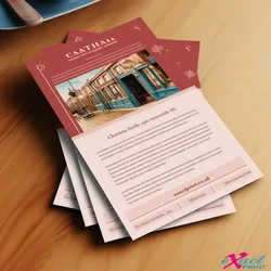
in someone's hand. A5 fits a pocket or a handbag, which suits event flyers and
offers people keep for later. A4 gives more room for detail, useful for menus,
price lists or anything with a bit more to explain.
|
Factor |
A5 Flyer |
A4 Flyer |
|
Size |
148mm x 210mm |
210mm x 297mm |
|
Best for |
Event promotion, quick offers, handouts |
Menus, price lists, detailed information |
|
Paper weight |
130gsm to 350gsm available |
130gsm to 350gsm available |
|
Finish |
Silk or matt |
Silk or matt |
Our A5 flyer printing suits pocket-sized
promotions, while our A4 unfolded flyer printing gives you room to breathe when
there is genuinely more to say.
Folded
or Flat, Which Works Harder
A flat A5 or A4 flyer works fine
for a single message. Once you have more to cover, a folded leaflet earns its
keep. Folding turns one sheet into several panels, so a restaurant can list
starters on one panel and mains on the next without cramming everything onto a
single page.
• Unfolded, simplest option, best
for one clear offer or announcement
• Half fold, doubles as a small
booklet, good for services with a few sections
• Z fold, three panels per side,
six in total, popular for maps, itineraries or step-by-step guides
Our A4 folded leaflet printing covers all of these fold
styles, with lamination options if you want the leaflet to survive being
handled a few times before it makes it home.
Getting
Your Artwork Print Ready
This is the bit that trips up
even confident designers. Screens show colour in RGB, but print uses CMYK, so a
bright blue on your laptop can print slightly duller unless the file is
converted before it reaches us. Set your artwork to CMYK from the start, and
colours will behave predictably.
Resolution matters just as much.
Anything under 300dpi looks sharp on a screen and slightly soft on paper,
especially on text. Leave a 3mm bleed around the edge too, so nothing important
gets trimmed off during cutting, and keep key text at least 5mm inside the trim
line. Small habits, but they are the difference between a crisp flyer and one
that looks like it was rushed.
Make
the Call to Action Impossible to Miss
A beautifully designed flyer
that hides its phone number in 8-point font at the bottom has failed at the one
job it had. Put your call to action in a colour that contrasts with the
background, make it bigger than you think it needs to be, and repeat it if the
layout allows.
The
Bottom Line
A flyer that gets read is not
about a clever design trick. It is about knowing what you want the reader to
do, giving that one action room to breathe, and getting the technical basics
right before it reaches print. Choose the size that suits your message, pick
the fold that fits how much you need to say, and always double-check bleed and
colour before you hit order. When you are ready to put it into print, start
with our A5 flyer printing range and build your campaign
from there.
FAQs
What size flyer works best for a small business promotion?
A5 is the most popular choice for
promotions and events because it is easy to carry and quick to read.
Do I need to convert my design to CMYK before printing?
Yes, converting from RGB to CMYK before
sending your file keeps the printed colours close to what you designed.
How much bleed should I leave on a flyer design?
Leave 3mm of bleed around every edge so
nothing important is accidentally trimmed off during cutting.
Is a folded leaflet better than a flat flyer?
Only if you have more than one core
message, a flat flyer usually works harder for a single, simple offer.
What paper finish looks most professional for a flyer?
A Silk finish gives a polished, premium
look, while matt suits designs with a lot of text that need to stay easy to
read.